65% of service business searches happen on phones. If your website isn't built for thumbs, you're frustrating the majority of potential customers.
Mobile users don't browse—they convert or bounce. There's no middle ground.
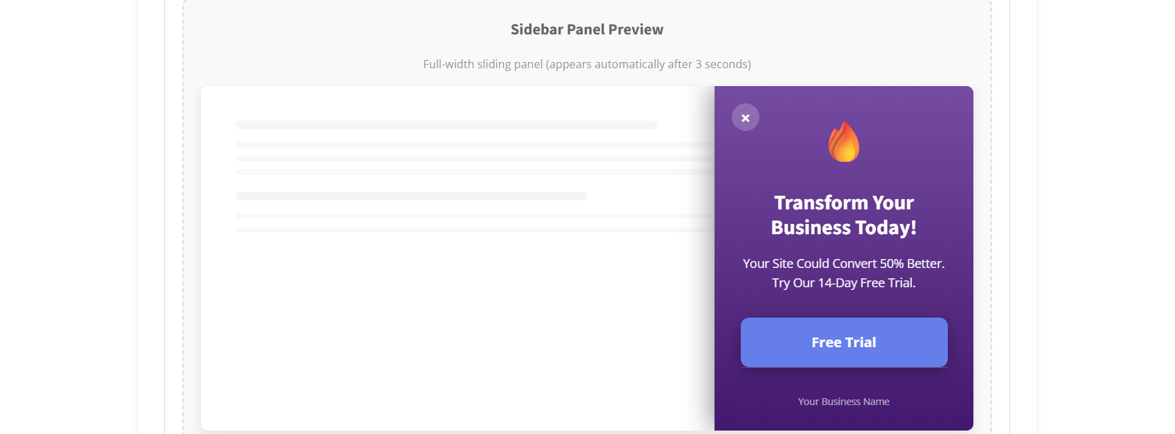
Desktop-designed forms frustrate mobile users. Thumb-friendly widgets close the gap.
Mobile behavior varies by industry. See specific optimization strategies for yours.
Quick quote requests
View details →Emergency tap-to-call
View details →Urgent service requests
View details →Service scheduling
View details →Booking on the go
View details →Storm damage reports
View details →Property photo uploads
View details →Immediate service requests
View details →Project photo submissions
View details →Same-day scheduling
View details →Quick estimate requests
View details →Multi-task requests
View details →Designed for one-handed use on any device.
Large tap targets, minimal fields, and smart keyboards. Filling out forms on mobile should be effortless.
Sticky call buttons that stay visible while scrolling. One tap to connect—no dialing required.
Lightweight widgets that don't slow down your site. Speed matters more on mobile than desktop.
Tools built for how people actually use phones.
Large tap targets and minimal fields. Designed for one-handed mobile use.
Always-visible call button that follows the scroll. One tap to connect.
Lightweight code that doesn't slow down mobile page loads. Every second counts.
Headlines rotate automatically to find what resonates best with mobile visitors.
Phone fields show number pad. Email fields show @ key. Reduce typing friction.
Looks great on any screen size. iPhone, Android, tablet—all covered.
Free 14-day trial. No credit card required. Starting at $29/month.
Start Free Trial